
STOP BLENDING IN
Be the brand that people notice, remember, and choose.
Your brand is a powerful asset — treat it like one.
We’re strategic creators who fuse intelligence with imagination to build brands that inspire curiosity, drive engagement, and connect with customers.
+ DRIVEN BY STRATEGY + DEFINED BY DESIGN
+ DRIVEN BY STRATEGY + DEFINED BY DESIGN

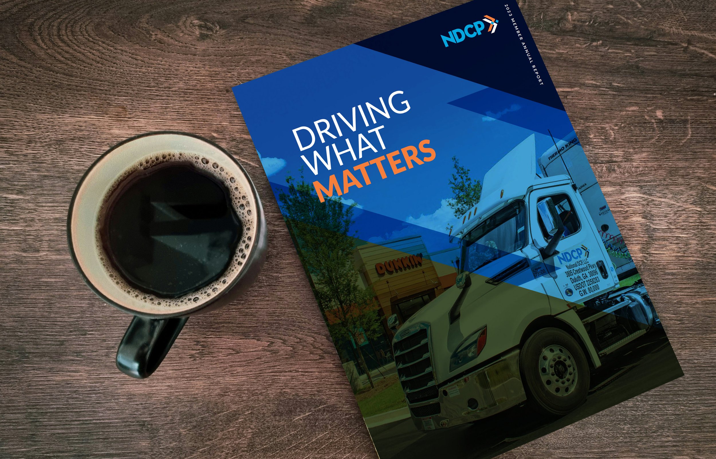

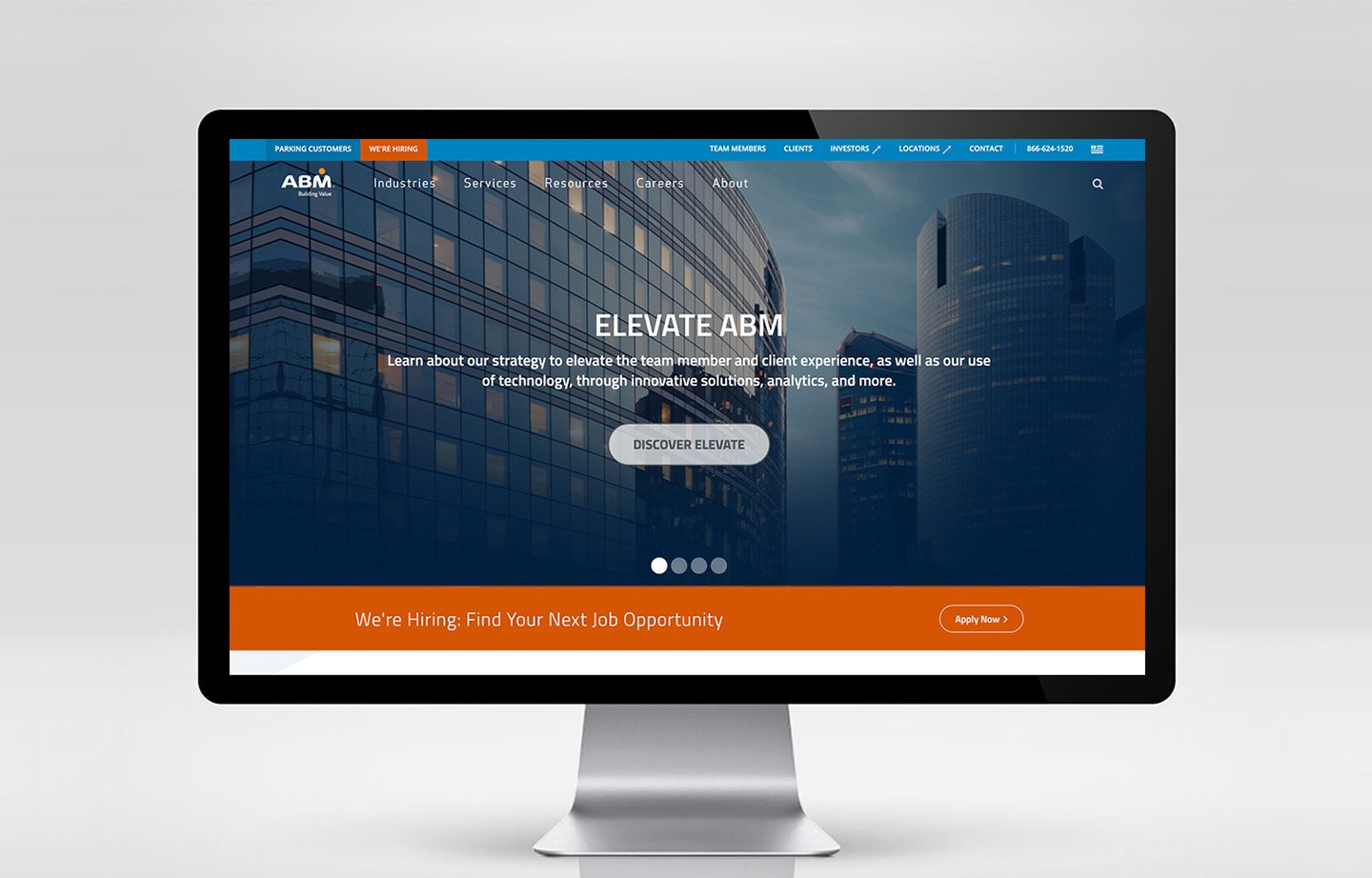


Brands We’ve Accelerated
Professional Services +
Supply Chain +
Manufacturing +
Finanacial Services +
Private Equity +
Healthcare +
Software +
Distribution +
Government +
Technology +
Insurance +
Telecom +
Energy +
Fintech +
Education +
Professional Services + Supply Chain + Manufacturing + Finanacial Services + Private Equity + Healthcare + Software + Distribution + Government + Technology + Insurance + Telecom + Energy + Fintech + Education +
Every brand challenge starts with the right questions.
Our process uncovers what makes your business distinct, giving us the foundation to create a purpose-built brand that attracts and engages at every moment.
